
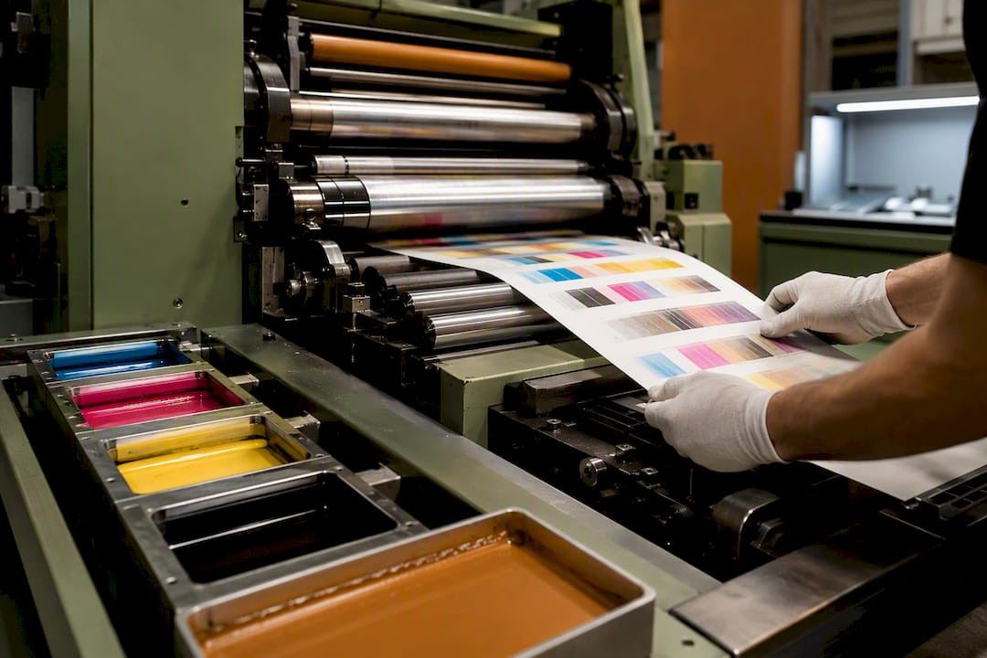
Avoid Color Surprises on Tickets: Pantone vs. CMYK Printing for Designers
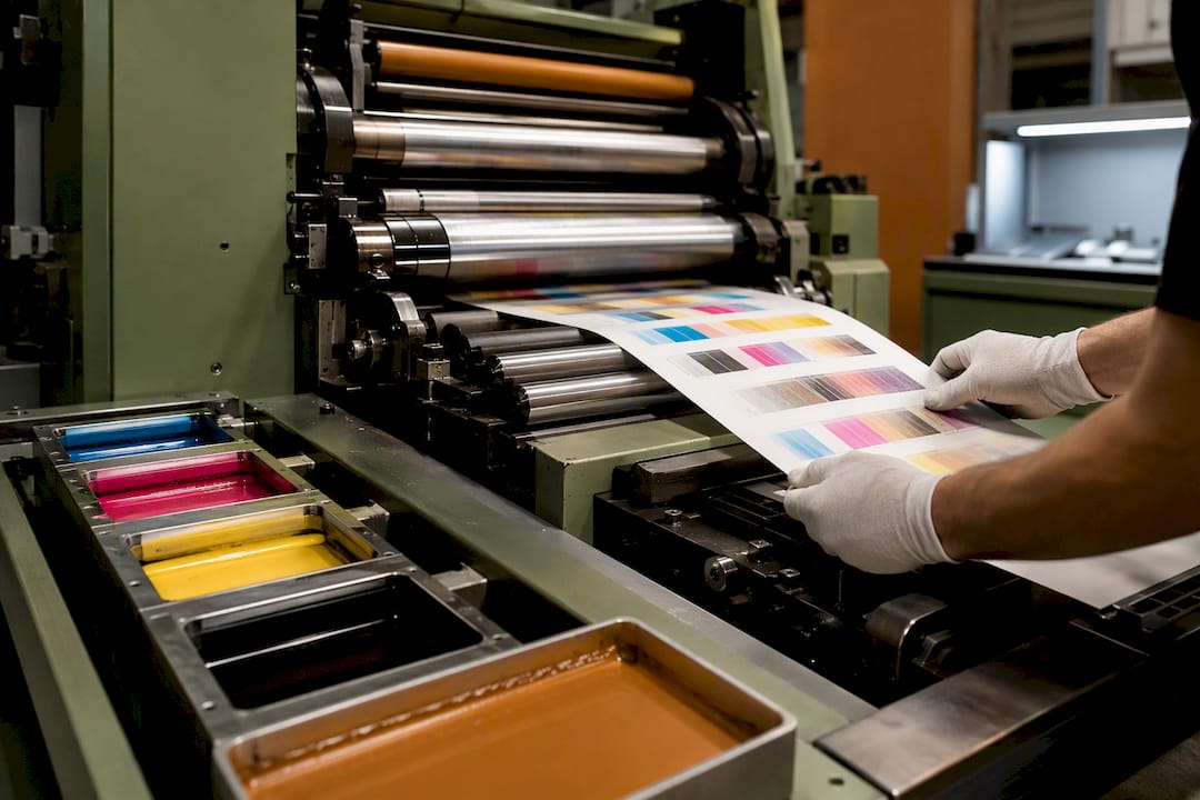
Use Pantone when a job depends on exact, repeatable brand color, metallics, fluorescents, or opaque printing on colored stock. Use CMYK for photography, gradients, and multi-color jobs where four-process ink keeps costs down. Most brand-sensitive print work ends up hybrid: CMYK handles the imagery, and one or two Pantone spot inks lock down the logo or accent color that has to match every time.
TL;DR:
- Pantone provides consistent, premixed inks ideal for exact brand color matching across various materials and vendors, especially for logos and solid colors.
- CMYK is better suited for photography, gradients, and printing jobs with multiple colors, as expanded-gamut presses can often approximate Pantone hues sufficiently for many applications.
- Converting Pantone to CMYK requires checking ΔE values and proofing on the actual stock; high ΔE indicates a need for spot ink or a bump plate for critical brand colors.
- Using spot inks involves higher setup costs on offset presses but can be cheaper and more precise for large solid areas and long runs, while digital CMYK is faster and more cost-effective for short runs.
- Substrate choice significantly impacts color accuracy, with coated stocks better for sharp halftones and dark or thermal stocks often requiring opaque or fluorescent inks for visibility and durability.
Table of Contents
- Pantone vs. CMYK Printing: What’s Actually Different
- When Should You Choose Pantone for a Print Job?
- When Does CMYK Make More Sense Than Pantone?
- How Do You Match and Convert Pantone Colors to CMYK?
- What Drives Production Costs Between the Two Systems?
- Why Substrate Choice Changes Everything for Tickets and Tags
- What Belongs on Your Preflight Checklist Before Printing?
- The Decision Flow Worth Repeating on Every Job
- Applying These Rules to Tickets, Permits, and Everyday Print
- How Caymil Helps You Get Color Right the First Time
- Where to Go Deeper on Pantone and CMYK
- Sources
- FAQ
Pantone vs. CMYK Printing: What’s Actually Different
Pantone and CMYK solve different problems, and confusing them is the fastest way to end up with a proof that doesn’t match the brand guide. Pantone uses premixed spot inks formulated to a specific standard, so the same PMS number should print consistently across different presses and printers. CMYK builds color by layering cyan, magenta, yellow, and black in tiny dots, and the result shifts depending on the press, the paper, and how well the shop calibrates its equipment.
Here’s how the two systems actually stack up on press:
- Color method: Pantone mixes a single premixed ink; CMYK layers four process inks in halftone dots.
- Gamut: Pantone reaches metallics, fluorescents, and pastels; CMYK is limited to what four transparent inks can simulate.
- Consistency: Pantone repeats reliably job to job; CMYK varies with press condition and stock.
- Production: Pantone typically runs on offset or screen presses; CMYK runs on both digital and offset equipment.
- Cost logic: Pantone needs a dedicated plate per color, which favors long runs; CMYK scales down to short digital runs cheaply.
- Hybrid use: pairing CMYK photography with one or two spot inks is standard for brand-sensitive packaging and print.
When Should You Choose Pantone for a Print Job?
Pantone earns its place whenever the same color has to look identical across vendors, materials, and years. If a client’s logo has to match on a brochure, a vehicle wrap, and a ticket stock printed by three different suppliers, spot ink removes the guesswork that comes with CMYK’s press-to-press variation.
Pantone also covers ground CMYK physically cannot reach. Metallics, fluorescents, and opaque whites fall outside the standard CMYK gamut, so no amount of process-color tweaking gets you there. Colorfyi notes that more than half of the Pantone library sits outside what CMYK can reproduce, which is why a “close enough” CMYK build often reads as noticeably duller or flatter on press.
Large solid areas favor spot ink too. A wide flat color block printed in CMYK can show visible dot patterns or banding; a premixed spot ink lays down smooth and even. And counterintuitively, spot ink is sometimes the cheaper route: a two-color job printed with two Pantone inks can beat the cost of a full four-color CMYK setup. For operational print like valet tickets or permit hang tags, locking a single spot color also reduces batch-to-batch variability that operators notice immediately.
When Does CMYK Make More Sense Than Pantone?
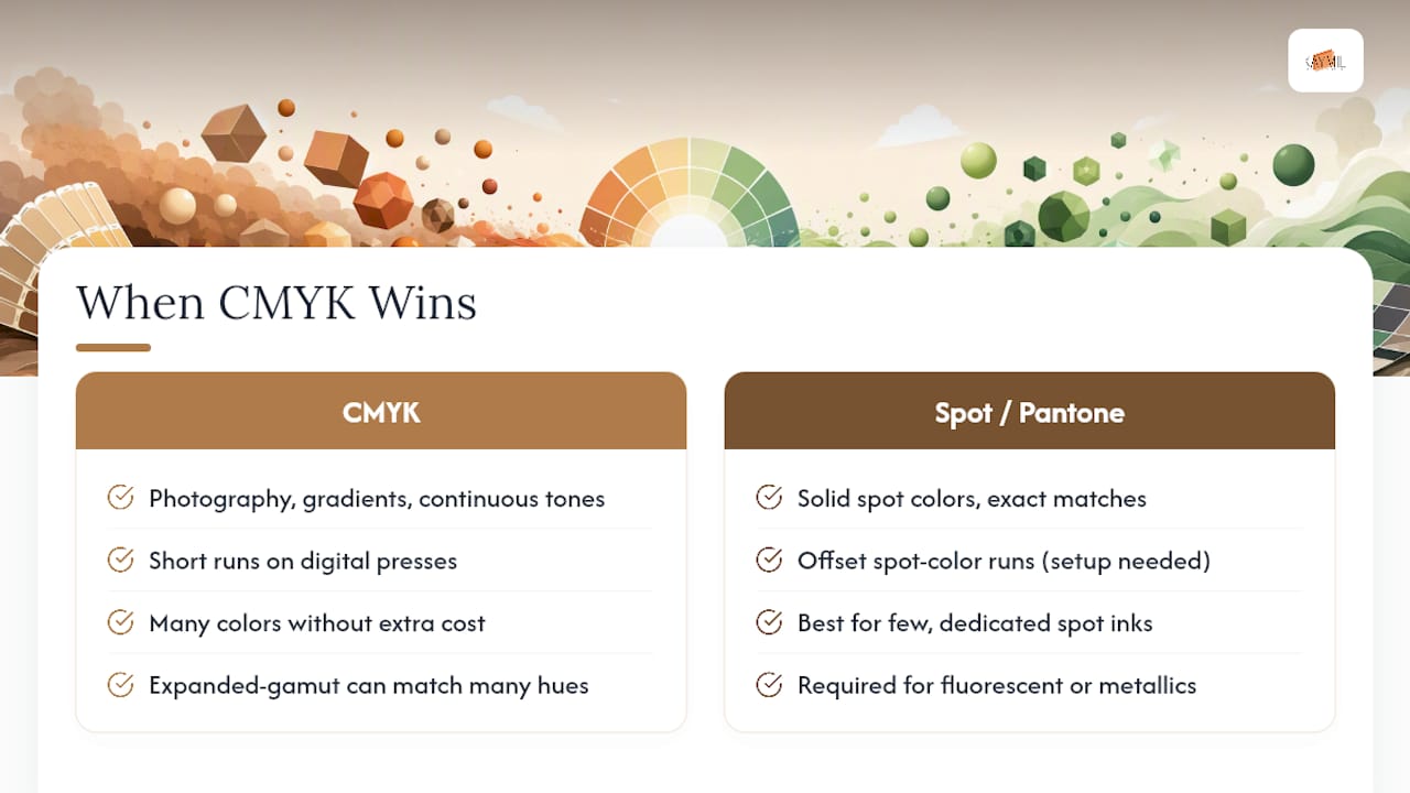
CMYK wins the moment a job involves photography, gradients, or more colors than a spot-ink budget can justify. Continuous-tone images, skin tones, and smooth color transitions need the layered halftone approach that four-process ink delivers; spot inks aren’t built for that kind of blending.
Digital presses are the other deciding factor. Most digital printers run CMYK only, which makes CMYK the default for short-run and on-demand jobs where setting up dedicated spot plates isn’t practical. If you need 500 pieces by Thursday, CMYK on a digital press almost always beats waiting on an offset spot-color run.
Expanded-gamut printing narrows the old gap between the two systems. Six-color and eight-color presses add extra ink stations beyond standard CMYK, and can simulate a large share of Pantone hues more faithfully than a standard four-color build. For mid-range brand colors that aren’t fluorescent or metallic, a well-calibrated CMYK or expanded-gamut approximation is often close enough that the client never notices the difference. Save spot ink for the colors that genuinely can’t be faked.
How Do You Match and Convert Pantone Colors to CMYK?
Converting a Pantone color to CMYK is a process of checking, not guessing. Skip the checks and you risk a client rejecting a proof that looked fine on screen but printed dull.
Start with Pantone Bridge. This reference guide shows the closest CMYK build for each Pantone number alongside the original spot color, so you can see the shift before it hits press. Look at the ΔE value, a measurement of color difference in Lab color space. A ΔE under roughly 2 is usually visually acceptable; higher values signal a shift most clients will spot immediately, especially in a logo.
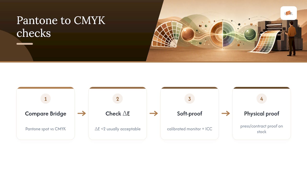
Soft-proof on a calibrated monitor using the printer’s ICC profile, then request a physical press or contract proof on the actual production stock. Screen previews lie more than most designers expect, particularly on uncoated or thermal papers.
Document everything in the job ticket. Label spot colors by their PMS number, record the approved CMYK fallback if one exists, and note who signed off. If the ΔE is too high for a brand-critical element, that’s your signal to add a bump plate or switch to spot ink rather than force a CMYK approximation.
What Drives Production Costs Between the Two Systems?
Every spot color added to a job needs its own plate and a dedicated press wash between colors, which is a real cost driver on offset equipment. That’s fine for a run of 50,000 tickets where the setup cost spreads thin, but it makes little sense for a run of 500.
Digital presses generally can’t add arbitrary spot colors because they’re built around fixed CMYK toner or ink stations. Some digital presses are configured with extra ink stations for expanded gamut or a white/clear station, but that’s a specific equipment choice, not the default. This is why short-run digital jobs default to CMYK and long-run offset jobs are where spot ink pays off.
Turnaround follows the same logic. A CMYK digital run can often ship same-week; a spot-ink offset run needs lead time for plate-making and press setup. Hybrid jobs combining CMYK imagery with one or two spot inks get scheduled and priced as offset work, since that’s the equipment that handles both.
Why Substrate Choice Changes Everything for Tickets and Tags
Decades of printing valet tickets, permit tags, and casino stock have taught Caymil that the color system matters less than what it’s printed on. Coated stock holds a tight, sharp halftone dot; uncoated and thermal stocks let ink spread slightly, which softens CMYK detail and shifts color noticeably compared to a coated proof.
Dark or colored ticket stock is where CMYK runs out of options entirely. Process ink is transparent, so it can’t sit opaque on a black or navy substrate. Opaque and fluorescent security inks solve that problem and add a visibility function CMYK can’t replicate.
Barcodes and variable data need their own rule regardless of the color system: keep them in high-density black, since colored halftones can reduce scanner reliability at the gate.
Pro Tip: Always run a scanner test on a printed sample before approving a barcode ticket job, not just a visual check. A barcode that reads perfectly under office lighting can fail at a dim parking gate.
Caymil’s practical checklist for operational print:
- Pull a physical stock sample before finalizing ink choice.
- Test barcodes on the actual scanner model in use, not a generic reader.
- Get a signed proof on final stock, not a digital mockup, before production runs.
What Belongs on Your Preflight Checklist Before Printing?
A clean file prevents most color surprises before they hit press. Run through this before sending anything to production:
- Confirm every spot swatch in the file is set to the correct Pantone library and named consistently. Stray “similar” swatches created by accident are a common source of extra plates.
- Embed the correct ICC profile and export using the printer’s recommended PDF/X standard, not a generic export preset.
- Check image resolution (300 dpi minimum for most commercial work) and total ink coverage, since excess coverage causes drying and rub-off issues.
- Request a contract proof on the final stock and get written approval before the job runs. A proof on the wrong paper tells you nothing useful.
Skipping any of these steps shows up later as a reprint, which costs far more than the five minutes preflight takes.
The Decision Flow Worth Repeating on Every Job
Ask one question first: is exact brand color the primary recognition cue, or does the job lean on photography and detail? That single question resolves most Pantone-versus-CMYK debates before they start. Run the Pantone Bridge check, get a proof on final stock, and record the approval. When both fidelity and imagery matter, plan for hybrid printing from the start rather than retrofitting it after a rejected proof.
Applying These Rules to Tickets, Permits, and Everyday Print
Caymil has printed tickets, tags, and operational stock since 1937, and the color-system choice always comes down to the same constraints: does the item need to match a brand book exactly, survive on dark or thermal stock, or scan reliably at a gate? Those questions decide the ink far more than personal preference does.
How Caymil Helps You Get Color Right the First Time
Getting Pantone-critical branding onto a valet ticket or permit tag without a color surprise takes more than a good file. It takes a printer who runs both spot and process work daily and knows how each behaves on ticket-grade stock.
Caymil produces custom logo parking tickets, barcoded ticket stock, and fluorescent security inks built for exactly the substrate and scanner constraints covered here. If a job needs opaque printing on dark stock, a fluorescent security ink, or a barcode that has to scan clean at a gate every time, Caymil can advise on the ink build before the first plate is made. Request a stock sample or a color proof through the parking forms catalog or start with machine-issued valet tickets built to your brand’s exact PMS numbers. Send your logo file and target Pantone numbers, and get a proof back before committing to a print run.
Where to Go Deeper on Pantone and CMYK
For further reading beyond this guide: Fujifilm’s explainer on Pantone versus CMYK covers the practical differences well. Adobe’s spot versus process color guide breaks down equipment limitations. PantoneTools’ breakdown of Pantone Bridge and ΔE is worth bookmarking for conversion checks, and Colorfyi’s piece on spot versus process colors explains gamut limits clearly.
Sources
- Pantone vs CMYK: What Are the Differences? - Fujifilm
- Pantone vs CMYK — What’s Actually Different | PantoneTools
- Spot colors vs process colors — key takeaways (Colorfyi)
- Spot color vs process color | Adobe
FAQ
Why Use Pantone Instead of CMYK?
Pantone gives you a premixed ink formulated to reproduce the same color consistently across different printers and presses, which CMYK cannot guarantee since its output shifts with press condition and paper.
How Do I Match CMYK to Pantone?
Look up the Pantone Bridge CMYK build for your target color, check the ΔE difference (generally under 2 is acceptable), then confirm with a soft proof and a contract proof on final stock before approving the job.
How Do I Convert Pantone Colors to CMYK?
Use the Pantone Bridge guide to find the closest CMYK equivalent, review it against your printer’s ICC profile, and if the resulting ΔE is too high for a brand-critical element, use a spot ink or bump plate instead of accepting the CMYK approximation.
Why Is Pantone 448 C Called the “Ugliest Color”?
Pantone 448 C was selected in a plain-packaging policy context specifically because researchers found it unappealing, showing that Pantone colors can be chosen for psychological effect and not just aesthetics.
Can Caymil Match My Brand’s Pantone Color on Tickets and Tags?
Yes. Caymil works with Pantone spot inks and CMYK process printing on ticket, tag, and permit stock, and can provide a proof on your final substrate before running full quantities.