
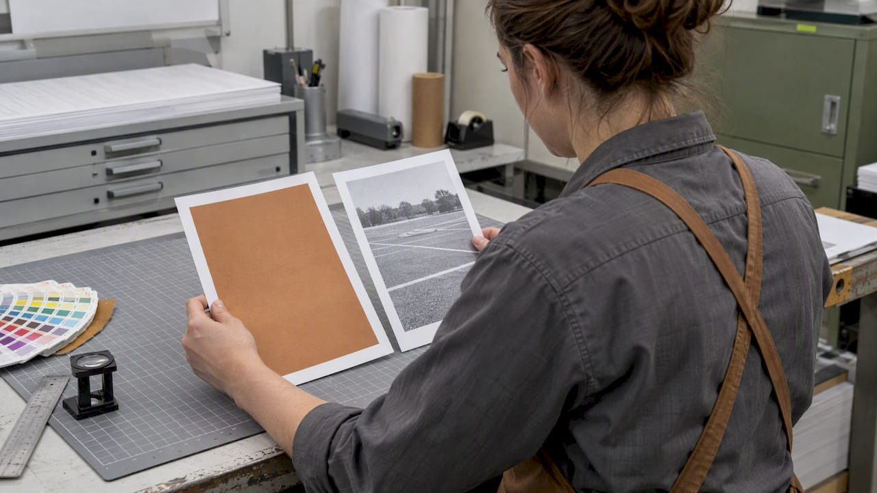
Spot vs Full Color: When 1–2 Spot Inks Beat CMYK for Ticketing Pros

Spot color uses premixed inks for exact brand matches, making it the right call for logos, permits, and identity-critical print runs. Full color, built from four process inks (CMYK), is the better choice for photos, gradients, and artwork with many colors. Hybrid approaches and expanded color gamut (ECG) printing exist too, and they’re worth a conversation with your printer before you lock in a method.
TL;DR:
- Spot colors are ideal for brand-critical items requiring exact, repeatable colors, such as logos, permits, and tickets, with each color needing its own plate.
- Full color CMYK printing is better suited for photographs, gradients, and artwork with many colors, where halftone dots blend to produce continuous tones.
- Using expanded gamut printing with additional inks can reproduce most Pantone colors efficiently, but it requires specific press configurations and profiling.
- Jobs with more than two spot inks typically become more expensive than CMYK, due to increased plate, setup, and cleanup costs.
- Accurate color matching depends on proper file preparation, including keeping spot colors separate and requesting proofs before the full run.
Table of Contents
- What spot color and full color actually are
- When spot color is the right choice
- When full color (CMYK) is the right choice
- Hybrid workflows and expanded color gamut explained
- Pressroom realities: plates, makeready, and cost
- How to prepare files so colors print as expected
- How Caymil applies these principles to tickets and permits
- Rules of thumb worth remembering
- How we help you get the color right on every ticket
- FAQ
- Sources
What spot color and full color actually are
Spot color printing applies a premixed ink, commonly specified through the Pantone Matching System, as a solid layer directly onto the substrate. Each spot color gets its own plate or press unit, which means the ink goes down exactly as mixed rather than being simulated. According to Printing, spot printing commonly uses one to three spot inks, and it’s the standard choice when a design needs flat, consistent color rather than photographic detail.
Full color, also called process or CMYK printing, works differently. Four base inks (cyan, magenta, yellow, and black) print as tiny halftone dots that the eye blends into a full range of hues. Adobe’s guidance notes that process color handles photographic reproduction and multi-color artwork, while spot color stays the better tool for solids and brand colors. CMYK has a narrower gamut than many spot inks, and factors like dot gain can shift how a color looks once it hits paper.
One distinction worth clearing up: Pantone is a standardized system for naming and mixing spot colors, but it isn’t the only kind of spot ink. Metallics, fluorescents, and other specialty inks are spot colors too, even outside the Pantone book, as Wikipedia’s overview of spot color points out.
A few quick examples make the split concrete:
- A valet ticket with a single logo color and a barcode is a natural spot-color job.
- A hotel brochure with product photography needs CMYK to render the images.
- A coupon book combining a brand mark with full-color product shots might use both.
When spot color is the right choice
Spot color earns its place whenever exact, repeatable color matters more than photographic nuance. Logos, permits, tickets, and signage all depend on brand colors looking identical from the first piece printed to the ten-thousandth, and spot inks deliver that consistency because they aren’t rebuilt from four screens every time.
Three situations call for spot color specifically:
- Brand fidelity on small, high-visibility items like logos, permits, and tickets, where a slight color shift would be noticeable and matter to the client.
- Special effects that only exist as spot inks, including metallics, fluorescents, and varnishes that CMYK simply cannot reproduce.
- Low color-count jobs, where printing one or two spot inks costs less than running a full CMYK press configuration.
That cost advantage has limits. Spot color stays economical for one or two colors but gets expensive fast once a design calls for three or more separate inks, since each one needs its own plate and cleanup cycle, a point Apex Transfers echoes when comparing CMYK to multi-spot builds.
When you specify a spot color, give your printer the PMS number, the substrate you’re printing on, and your expected run length. Ink behaves differently on coated stock versus uncoated stock, and a printer who knows your run length can tell you whether spot ink or CMYK makes more financial sense.
Pro Tip: Always request a physical ink drawdown or printed proof on your actual substrate before approving a spot color; screen previews rarely match the final ink laydown.

When full color (CMYK) is the right choice
Full color is the clear winner whenever a design includes photographs, continuous tones, gradients, or artwork built from more than a couple of colors. Trying to match a sunset photo or a gradient background with spot inks isn’t practical, since CMYK’s halftone dot structure is what creates the illusion of continuous color in the first place.
Cost tends to favor CMYK once a job’s color count climbs. Running three or more spot inks on an offset press often costs more than a standard four-color CMYK setup, since CMYK uses the same four plates regardless of how many colors the artwork appears to contain, a trade-off Apex Transfers also highlights.
A few practical notes for choosing and specifying CMYK:
- Digital presses and offset presses can render CMYK slightly differently, so confirm which process your printer will use before finalizing files.
- Some color shift between your screen and the final print is normal and expected with CMYK; design with that tolerance in mind rather than chasing pixel-perfect matches.
- Request a contract proof before a large run, especially when brand colors fall inside the artwork alongside photography.
- Build files in a wide color space (RGB or Lab) when possible, then convert deliberately, rather than designing directly in CMYK from the start.
Hybrid workflows and expanded color gamut explained
Spot and CMYK aren’t the only two options on the table. Simulated process, common in screen printing, builds photographic-looking images using a limited set of spot inks rather than true CMYK, giving designers more control over texture and opacity on garments and similar substrates.
A more press-oriented alternative is expanded color gamut (ECG) printing, which adds orange, green, and violet inks to the standard CMYK set (often written as CMYKOGV). Research summarized in a TAGA abstract on expanded gamut printing found that ECG can reproduce 90 to 95% of the Pantone Plus book in trials, while also reducing makeready time and ink waste compared to running multiple dedicated spot units.
That efficiency comes with a catch: ECG requires a press configured with the extra ink stations and a profiling workflow to match Pantone references accurately, so it’s not a drop-in replacement for every shop.
- Simulated process fits screen-printed goods where spot inks already dominate production.
- ECG fits brands running frequent short jobs that would otherwise need many dedicated spot plates.
- Standard spot plus CMYK still fits most single-logo, photo-inclusive jobs without a press upgrade.
Pro Tip: Ask your printer directly whether their press is ECG-capable before specifying it; not every shop has the ink stations or profiling tools to support it.
Pressroom realities: plates, makeready, and cost
Every spot color you specify needs its own plate or press unit, and each one adds setup time before the first good sheet rolls off the press. Webopedia notes that unnecessary spot colors raise cost and makeready time, and on presses with limited units, a job can become infeasible if you specify more colors than the press can run in one pass.
Here’s how the math tends to shake out:
- One to two spot colors usually costs less than full CMYK, since you’re only running the inks you need.
- Three or more spot colors typically costs more than CMYK, because each added ink multiplies plate charges and cleanup time.
- Photographic content paired with a single brand spot color is workable but adds complexity, since you’re running a hybrid setup rather than a standard four-color job, a combination GoNextPage flags as something to confirm with your printer before committing to files.
ECG printing can replicate 90 to 95% of the Pantone Plus color book in trials while reducing ink waste and makeready time compared to multi-spot setups, according to TAGA research. That matters for shops managing large ink inventories, since every unused spot ink on the shelf is money and shelf space tied up.
Before you finalize a brief, ask your printer three questions: how many press units are available for this job, what their typical makeready time runs for your color count, and how proofs will be delivered and approved before the full run starts.
How to prepare files so colors print as expected
File prep is where color plans either hold up or fall apart. If a design needs a guaranteed brand match, build that color as a named spot channel rather than converting it to CMYK early. Save spot-channel work as layered PSD, TIFF, or PDF files that preserve the spot plate separately from the process plates, so your printer can output it correctly.
- Keep spot channels intact until your printer confirms the final separation setup.
- Edit color-critical images in RGB or Lab space first, then proof the conversion to CMYK rather than editing directly in CMYK from the start.
- Treat CMYK-only editing as a risk for brand colors specifically, since adjustments made after conversion can shift the final hue in ways that are hard to predict on screen.
Selective color correction is the workflow step most designers skip. It follows a sequence: establish tone reproduction, balance grays, then apply selective color correction to fix specific hue errors, all before the file goes to press. Fixing ink hue problems on press is a blunt tool that affects the whole sheet, not just the color that’s off, so catching the issue in RGB or Lab before separation saves a reprint.
When you request proofs, ask for a contract proof for color-critical jobs and specify your target Pantone reference or acceptable ΔE tolerance so your printer knows exactly how close the match needs to be.
Pro Tip: Send your printer a one-page prepress checklist listing spot color names, target substrate, and proof type requested; it prevents the most common file-related delays.
How Caymil applies these principles to tickets and permits
Tickets, permits, and hang tags live or die on fast visual recognition, which is exactly why spot color dominates this category. A valet attendant or parking enforcement officer needs to identify a ticket’s color and brand mark in a glance, and a premixed spot ink delivers that consistency run after run in a way a color-shifting approximation can’t.
Caymil’s own guidance on custom logo parking ticket options points operators toward spot color whenever a logo or brand mark needs to stay identical across large print runs. That same logic extends to sequential numbering and barcoding, where crisp, consistent ink laydown keeps scanners reading cleanly.
- Spot color suits tickets, permits, and hang tags where exact branding and fast scanning matter more than photographic detail.
- CMYK or a hybrid approach fits ticketing pieces that lean into marketing, such as coupon books or promotional inserts with photography.
- A clear color-coding strategy for multi-location operations depends on spot ink consistency across separate print runs.
- Sharing substrate, run length, and PMS references upfront keeps color proofs accurate and avoids reprint delays.
Rules of thumb worth remembering
Three heuristics cover most spot versus CMYK decisions: if the job is a logo, permit, or anything needing exact brand color, reach for spot. If it includes a photo or more than two colors, reach for CMYK. If you’re unsure, ask your printer before you finalize files rather than after.
The mistakes that cause reprints are rarely about the color choice itself. They’re mislabeled spot channels that get accidentally converted during prepress, designers specifying four or five spot colors when the press only has four units, and skipping a contract proof on a job where brand color really mattered. ECG deserves a mention here too: it’s a pragmatic middle path for shops running frequent short jobs that would otherwise burn through spot ink inventory, though it only works where the press is actually configured for it.
— Richard
How we help you get the color right on every ticket
We build valet and parking tickets with spot-color logo printing, sequential numbering, and barcoding to ensure consistent brand appearance across print runs. Whether your job calls for a single spot color or a full-color design with photography, we work from your PMS references and substrate choice to keep results predictable.
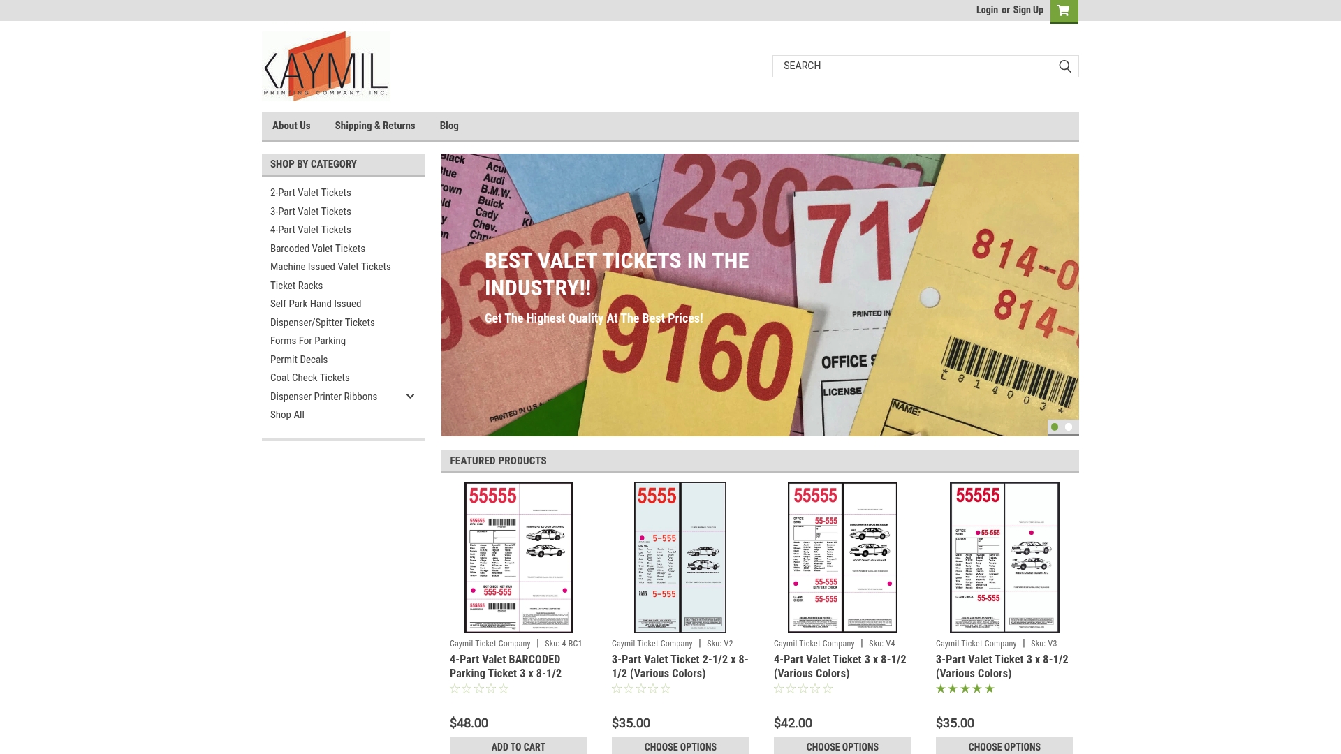
Our 2-Part Valet Tickets, 3-Part Valet Tickets, and 4-Part Valet Tickets all support custom spot-color branding, and our Barcoded Valet Tickets add scan-ready barcoding to the same color-accurate setup. Browse the full lineup on our shop page and request a color proof or sample swatch before you commit to a run. Send us your PMS number, substrate preference, and run length, and we’ll get you a proof that shows exactly what your tickets will look like off the press.
FAQ
Is spot color the same as Pantone?
Not exactly. Pantone is a widely used standardized system for naming and mixing spot colors, but any premixed or specialty ink, including metallics and fluorescents outside the Pantone book, also counts as a spot color, according to Wikipedia’s entry on spot color.
Can you give me an example of spot color?
A logo printed in one exact brand color on a valet ticket is a classic spot-color example, since the ink is premixed and applied as a solid rather than built from halftone dots. Metallic or fluorescent accents on packaging are spot colors too, even when no Pantone number is involved.
Which color mode is best for printing?
It depends on the artwork: spot color is best for logos and solid brand colors, while CMYK (full color) is best for photographs and designs with many colors, per Adobe’s spot versus process guidance. Many print jobs combine both, using spot for the brand mark and CMYK for supporting imagery.
What’s the difference between spot color and CMYK?
Spot color uses a single premixed ink applied as a solid layer, while CMYK builds color from four inks printed as halftone dots that blend to simulate a full range of hues. Spot color gives exact, repeatable brand matches, while CMYK handles photographic detail and multi-color artwork that spot inks can’t practically reproduce, as explained by printing.unl.edu.
Sources
- Spot vs CMYK colors - University of Nebraska–Lincoln printing
- Spot color vs process color — Adobe
- TAGA abstract on expanded gamut printing