Barcode Print Contrast on Parking and Valet Tickets

Barcode print contrast is the difference in reflected light between the dark bars and the light spaces of a code. A scanner can only decode what it can tell apart. For parking and valet tickets, that means black bars, a light and non-transparent stock, consistent ink density and a ticket that keeps its contrast after sun, heat and handling. Get those four things right and most failed scans never happen.
This guide is written for parking operators, valet companies, hotel and casino parking managers and facility teams who order barcoded tickets in volume. It covers what contrast means in measurable terms, the thresholds worth holding, what erodes contrast on the street, and how to confirm a print run is good before it reaches the booth.
TL;DR
- Print contrast is the reflectance gap between bars and spaces. Dark bars on a light, opaque stock give the widest gap and the fastest, most reliable reads.
- Common grading guidance treats a symbol contrast of 40% or more as a Grade C, and below 20% as a failing symbol. Many operators aim well above the minimum.
- Dark ticket stock, red bars, glossy finishes, show-through and faded ink are the usual causes of low contrast.
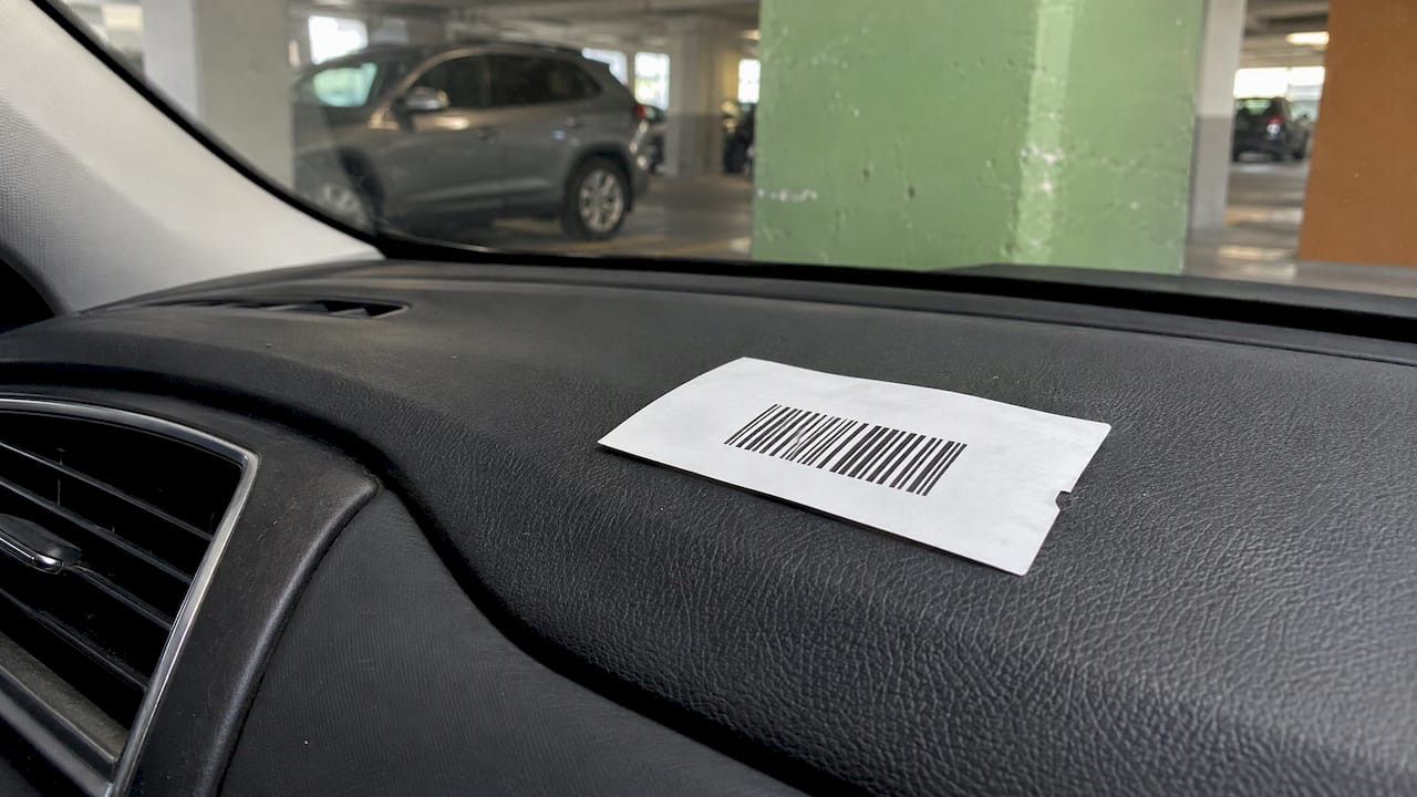
- Heat and sunlight on a dashboard can reduce contrast over time, so stock choice matters as much as artwork.
- Check contrast on a proof and on the first production tickets, not after 50,000 are printed.
Table of Contents
- What print contrast means on a parking ticket
- Contrast thresholds worth knowing
- What lowers contrast on parking and valet tickets
- Layout problems that look like contrast problems
- How to specify tickets for strong contrast
- Verifying contrast before a full run
- Troubleshooting a ticket that will not scan
- Our perspective
- Barcoded tickets built for your lanes
- FAQ
- Sources
What print contrast means on a parking ticket
A barcode reader works by comparing the light reflected from dark and light elements of the symbol. It does not see color the way a person does. It sees how much red or infrared light bounces back. Bars must reflect little. Spaces and the margin around the code must reflect a lot.
When the two are too close, the reader may be unable to distinguish the barcode from its substrate, and the result is a no-read. Low contrast is listed there among the most common causes of unreadable codes, alongside quiet zone violations, improper reading position, inconsistent printing and damage.
Even when a low-contrast code does decode, there is a cost. The same source notes that low contrast or non-uniform elements can slow decode time and shorten the distance at which a code can be read. In a valet lane or an exit lane, a half-second delay on every car adds up quickly.
Contrast terms you will see on a verifier report
- Rmax and Rmin: the reflectance of the lightest area (the background) and of the darkest bar.
- Symbol contrast (SC): the difference between them. SC equals Rmax minus Rmin, expressed as a percentage.
- Print contrast signal (PCS): an older, related measure that some operators and printers still quote. A common target in the industry is a minimum of 0.50, with 0.80 or higher recommended for the best scan performance.
You do not need to be a metrologist. You need to know that the number exists, that your printer can be asked about it, and that it can be measured.
Contrast thresholds worth knowing
The US reference for print quality grading is ANSI X3.182. The IBCA guide explains that it grades print quality from A to F across eight measurement categories, with any grade other than F counted as passing. Symbol contrast is one of those categories, and the guide notes that the whiter the spaces and the blacker the bars, the better the symbol contrast.
The figures below come from published grading guidance. Treat them as minimums for a clean read, not as targets.
| Symbol contrast grade | Minimum symbol contrast | Practical meaning |
|---|---|---|
| A | above 70% | Strong, comfortable margin |
| B | above 55% | Good for most scanners |
| C | 40% or more | Lowest grade many specifications accept for general use |
| D | 20% or more | Marginal, reads depend on the scanner |
| F | below 20% | Fails |
The A, B and C breakpoints are described in a barcode verification paper. The C and D minimums, 40% and 20%, are also set out in the GS1 validation and verification guide, which adds that the darkest bar should reflect no more than half the light of the background.
One trade publication notes that 40% is the threshold for a C grade, with a lower 20% bar sometimes applied to rough substrates such as corrugated board. A smooth valet ticket is not corrugated. Aim for the higher number.
Why a minimum is not a goal
A ticket does not live in a lab. It gets bent in a pocket, rubbed on a dashboard, scanned by a worn handheld in low light, and scanned again by a different device at the exit. Every one of those conditions shaves a little off contrast. A ticket that grades at the bare minimum on the press has no room left for any of that. A ticket that grades a B or an A has margin.
What lowers contrast on parking and valet tickets
Ticket stock and background color
The best contrast comes from a black barcode on a white, non-transparent background. The same source warns against unfavorable pairings such as red on white, black on blue and black on green.
Valet operators run into this often because colored stock is a popular way to separate shifts, locations or ticket types. A reader will struggle with a dark base. One valet-software support page advises against dark ticket stock because scanners have trouble picking up a black code against dark blue stock. It also suggests keeping a QR code at roughly 0.75 by 0.75 inches.
If you want color coding, keep the barcode field light. Pale stocks, a color band outside the barcode zone, or a colored border all let you identify tickets at a glance without touching the read area. Our guide to spot color versus full color covers how to keep ink choices simple on ticket artwork.

Bar color
Scanners measure reflectance differences, and many use red illumination. Red bars on a light background can nearly disappear to the reader even though a person sees them clearly. Black is the safe default. Dark navy or a very dark green can work in some cases, but only after a proof has been verified.
Reversed codes
A light code on a dark field is risky. The Weber guidance describes reversed color as a risk and treats white spaces on a dark background as a workaround only when the background cannot change. On a ticket, the background can almost always change. Keep it dark on light.
Show-through, gloss and screening
GS1 lists show-through, transparent overwrap, specular materials and half-tone screening as things that can reduce barcode contrast. On a multi-part carbonless ticket, the practical lessons are:
- Use a stock opaque enough that printing on the back does not show through under the barcode.
- Print the barcode as a solid black element, never as a screened tint or a gray built from dots.
- Avoid glossy coatings or laminates over the code, which can bounce light straight back at the scanner.
Heat, sunlight and aging
A parking ticket spends time on a dashboard. Thermal paper is built on a coating that reacts to heat. One supplier explains that prolonged UV exposure breaks down the image-forming compounds, which fades the print and reduces contrast. It singles out parking tickets left on dashboards as a typical case.
For tickets that must stay readable through a long stay, stock selection is part of the contrast decision. Our article on parking ticket paper, thermal rolls and what lasts goes through the options by use case, and the one on dust-resistant ticket media covers garages and valet stands where grit and handling are the main wear.
Layout problems that look like contrast problems
Not every no-read is a contrast failure. Three layout issues mimic it.
- Quiet zone too small. The blank margin on both sides of a linear barcode is part of the symbol. If printed text, a fold, a perforation or a logo crowds it, the reader cannot find the edge of the code. We cover the margin in detail in barcode quiet zone.
- Code too narrow or too tightly packed. A symbology that packs more data into the same width forces thinner bars. Thin bars smear more easily and lose contrast at the edges. Choosing between formats is explored in Code 128 versus Code 39, and the broader decision in parking barcode formats for operators.
- Low-resolution artwork. A barcode scaled up from a small image blurs at the edges. Troubleshooting guidance for printed QR codes lists upscaling blur and a lost quiet zone among common causes of failed scans. Supply barcodes as vector artwork or generate them at their true size.
How to specify tickets for strong contrast
When you order barcoded valet or parking tickets, put contrast into the specification. A short checklist keeps it from getting lost between purchasing, operations and the printer.
- Stock: white or a very light color, opaque, with no gloss over the barcode area.
- Bar color: solid black, or the darkest ink in your palette, never red.
- Background: no tint, pattern or photo behind the code.
- Code placement: away from folds, perforations, staple or glue lines, and tear-off edges.
- Quiet zone: clear space on both sides, confirmed on the proof.
- Format: matched to your scanners and parking system, with the narrowest bar width your equipment reads comfortably.
- Environment: thermal, paper, or synthetic stock chosen for how long the ticket stays in the sun.
For machine-issued tickets, black-mark placement also matters, since the dispenser reads it to position the ticket. See our notes on black-mark ticket specs for how to keep that clear of the barcode.
Verifying contrast before a full run
The cheapest time to find a contrast problem is the proof. The most expensive is the exit lane.
Check the proof
A proof is your chance to check bar color, background, quiet zones and placement. Our print proof checklist walks through what to look at before signoff, including barcode data and position.
Scan with the real equipment
Take the proof or first sample tickets and scan them with the handhelds, fixed readers or gate scanners you actually use, at the distances and angles your staff use. Try them in the dimmest and brightest conditions on site, including a booth in direct sun and a garage level with poor lighting. A code that reads once at a desk has not been tested.

Use a verifier for high volumes
For large orders, a barcode verifier measures contrast and other parameters objectively. The IBCA describes verifiers as instruments that analyze print quality using a specified light source and spot size, and recommends verifying often enough to ensure printing processes supply in-spec barcodes. A verifier also lets you hold a figure against the grading table above rather than relying on whether a scanner happened to read it.
If you do not own a verifier, ask your supplier what verification they perform and what grade you can expect on your chosen stock.
Troubleshooting a ticket that will not scan
When a barcode fails in the field, work from the simplest cause to the hardest.
- Look at the ticket. Is the print faded, streaked or blotchy? Is the stock curled or stained? Inconsistent printing and background variation are a classic cause of no-reads from low contrast, along with reflections and shadows.
- Check the lighting. Glare off a shiny surface or a shadow across the code can defeat a good print. Move the ticket and retry.
- Check the quiet zone. Make sure nothing is printed or folded into the margins.
- Check printer settings, for on-demand printing. One troubleshooting guide recommends raising print darkness and slowing print speed to improve contrast, and replacing a faded ribbon or labels. It also lists glare from laminate, cold media and rain among environmental causes.
- Check the scanner. A dirty window, a worn scanner or a symbology that is not enabled in its settings can mimic a print problem. Compare against a known good ticket.
- Compare batches. If failures cluster in one lot, one shift or one printer, you have a print consistency problem rather than a design one. Keep a sample from each lot.
Note what you find. If the same cause recurs, the fix belongs in the specification, not in the booth.
Our perspective
We have manufactured parking and valet tickets since 1937, and the pattern we see is consistent: barcode problems are rarely mysterious. They come from a decision made early, usually a colored stock chosen for appearance, a code squeezed into too little space, or artwork approved without a scan test.
That is why we treat contrast as a specification item, not an afterthought. Our barcoded valet tickets are designed around durable printing, clear sequential numbering and compatibility with major parking systems, and we encourage operators to talk through stock, ink and format before they approve a run.
Our advice is simple. Keep the barcode field light and the bars black. Give the code its margins. Scan a proof on the equipment you actually use. When a ticket also has to survive a hot dashboard, choose the stock for that job. With those steps in place, a ticket does the one thing it exists to do: it gets the car back to the right customer quickly.
Richard
Barcoded tickets built for your lanes
If you are ordering new barcoded tickets, start with the format that matches how your operation runs. Our barcoded valet tickets are listed at $42 to $48, and our 4-part valet tickets carry the same published range, with carbonless copies for the key, the vehicle and the customer. For machine-issued formats, see our dispenser and spitter tickets.
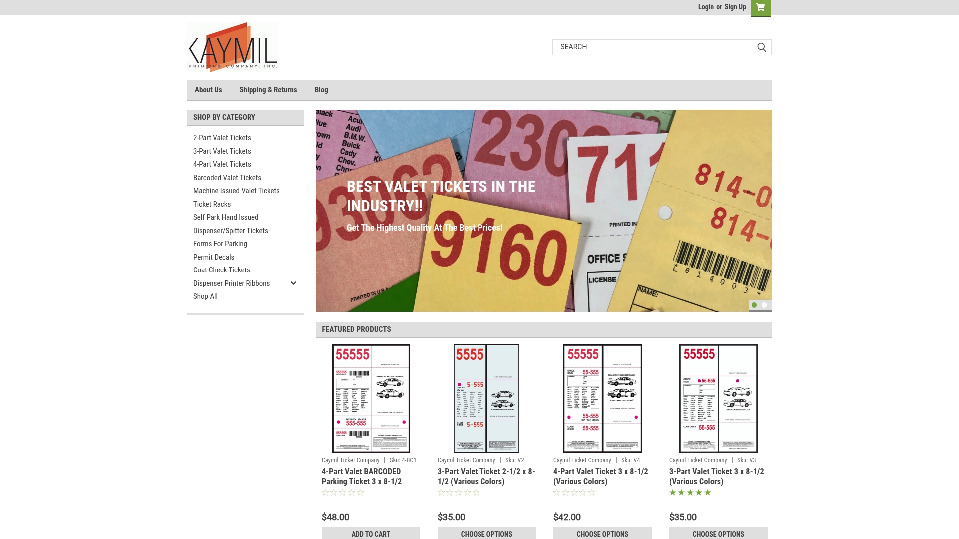
We offer stock and fully custom printing with options for logos, sequential numbering, barcoding and security features, and our tickets are compatible with major parking systems including Amano, TIBA, SKIDATA, FLASH Parking, Scheidt & Bachmann and Flowbird. Tell us your scanners, your stock preferences and your lane conditions, and we will help you specify a ticket that reads cleanly. Browse the full range at Caymil.
FAQ
What is a good print contrast for a parking ticket barcode?
Published grading guidance treats symbol contrast of 40% or more as a Grade C and above 70% as a Grade A. Some operators also work from PCS targets, with 0.80 or higher cited for strong scan performance. Aim for the higher end so heat, wear and aging do not push the code toward failure.
Can I print barcodes in color on valet tickets?
Yes, with care. Black bars on a light, opaque background are the safest choice. Red, blue and green bars on light stock can lose contrast depending on the scanner light, so verify any color choice on a proof before a full run. Keep color for borders, logos and text outside the barcode area.
Does thermal paper lose barcode contrast over time?
It can. Thermal coatings react to heat, and prolonged UV exposure breaks down the image, which fades the print and lowers contrast. For tickets that sit on a dashboard for hours or days, select the stock with that exposure in mind, and talk to us about options for your operation.
Why does a barcode scan on my desk but not in the lane?
Lighting, angle, glare, distance and scanner condition all change in the field. A code with only marginal contrast may read under ideal conditions and fail under a sunlit windshield or a dim garage. Test samples in the real environment and keep contrast well above the minimum.
How do I check contrast without a verifier?
Scan proof tickets with every scanner type you use, at different distances, angles and light levels, and keep a sample that fails for comparison. This is not a substitute for measurement on large runs, but it catches most layout and color mistakes early.
Sources
- Acceptable Color Combinations for Barcode Symbols
- The Most Common Causes of Unreadable Barcodes
- Three ways to deal with no-reads caused by low-contrast barcodes
- GS1 bar code validation and verification guide
- Bar Code Print Quality (IBCA)
- Getting it Right: barcode verification
- Want to Use Bar Code Colors? What Works?
- 6 tips for an error-free barcode
- 5 tips on barcode colours
- Barcoding for Designers, Printers and Packagers (GS1 Canada)
- Valet ticket recommendations
- Why Thermal Receipts Fade: Heat, UV and Chemical Exposure
- QR Code Not Scanning When Printed
- Parking citation barcode won’t read