
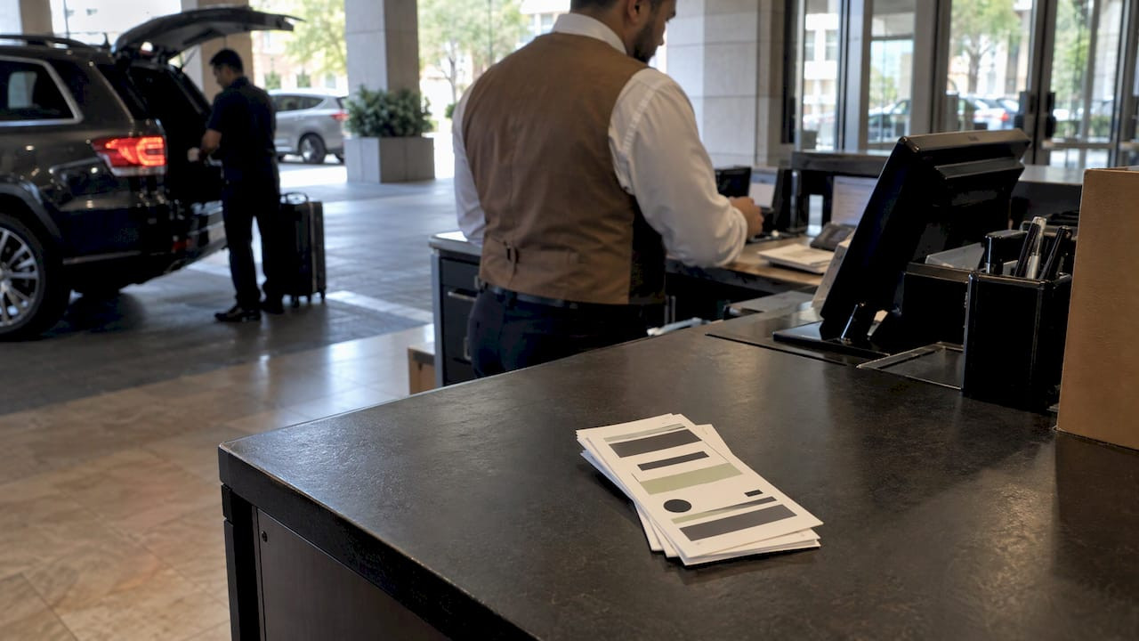
High Contrast Ticket Layouts for Parking and Valet Operations

A high contrast ticket layout puts dark ink on a light, matte stock, sets the few fields attendants must read in large type, and keeps barcodes clear of anything that could crowd them. Do that, and tickets stay readable at night, in glare and in a wet hand-off at the curb. Caymil has manufactured parking and valet tickets since 1937, and the layout rules below are the ones that matter when a ticket has to work in a real lane, not on a mood board.
The search results for this topic are full of decorative concert and party ticket galleries. A parking or valet ticket does a different job. It is a claim check, a control document and sometimes a scan target. Style comes second to a ticket that an attendant can read in two seconds.
TL;DR
- Use dark text on a light, matte background. Pure black on white or off-white is the safest pairing for both people and scanners.
- Give the ticket number, plate or vehicle field and time the most size and weight. Push legal text and secondary details down.
- Keep barcodes in black on white with clear space on both sides, and never place logos or borders against the bars.
- Keep brand colors in headers, bands and logos, not in the fields that get read or scanned.
- Check every proof under the lighting your attendants actually work in before you print a full run.
Table of Contents
- What “high contrast” means on a printed ticket
- Choose the right color and stock pairing
- Set type size, weight and spacing for fast reading
- Decide what stands out first
- Lay out barcodes so they scan the first time
- Keep brand colors without losing readability
- A proofing checklist before you print
- Where Caymil fits
- Our perspective
- FAQ
- Sources
What “high contrast” means on a printed ticket
Contrast is the difference in brightness between the text and the surface behind it. It is not the same as color difference. Guidance on visual contrast from the Institute for Reading Technology says a design needs strong luminance contrast, that smaller or thinner text needs even more, and that hue alone should never be the only thing separating one detail from another. Red text on a green band can look vivid and still vanish for a colorblind attendant or under sodium lighting.
The U.S. Access Board adds the physical side. Its guidance on communication elements says legibility is affected by shadows, glare and the uniformity of text and background colors and textures. For the visual signs the ADA standards cover, it calls for a non-glare finish and either light-on-dark or dark-on-light contrast. A claim ticket is not a sign, but the same physics applies to a ticket held under a garage fixture or a porte-cochere lamp.
Two practical points follow:
- Contrast is a property of the printed result, not the artwork file. Ink density, paper shade and the printer all change it.
- Dark-on-light usually wins on tickets. Reversed text (white on a dark band) is acceptable for a large header, but fine print reversed out of a color often fills in during printing and loses legibility.
Digital contrast ratios are a different test
You may see WCAG ratios quoted for contrast. Section508.gov explains that WCAG 1.4.3 sets a minimum of 4.5:1 for smaller text and 3:1 for large-scale text in electronic documents and images. That standard governs screens and PDFs. It is a useful sanity check on your artwork proof, but a printed ticket is judged by what the ink does on the stock, so test the physical sample as well.

Choose the right color and stock pairing
The most dependable combination is black ink on white or off-white stock. The European Blind Union’s clear print guidelines recommend high contrast such as black on white, a matte paper finish rather than gloss, and note that off-white is preferable to pure white because it cuts glare. Those guidelines were written for readers with low vision, which makes them a good standard for tickets handled by tired people at 11 p.m.
| Choice | Works well | Watch out for |
|---|---|---|
| Black on white or off-white | Everything: fields, numbers, barcodes | Gloss coatings that reflect headlights |
| Black on pale yellow or light tint | Zone or day identification by stock color | Tints dark enough to lower text contrast |
| Dark blue or dark green on white | Brand-colored headers and large numbers | Small print, and any barcode |
| White on dark band | Large headers or lot names | Fine print, which can fill in |
| Red on dark or on a medium tone | Nothing critical | Hue-only differences, scanner invisibility |
Stock color is a strong operational tool when you use light tints. A different pale tint per shift, lot or event lets a supervisor spot a mismatched ticket from across a lane without any of the printed text losing contrast. Keep the tint light enough that black text still reads as the strongest thing on the page.
For help choosing between paper types, thermal and carbonless, see Caymil’s guide to parking ticket material options and the overview of ticket paper, thermal rolls and what lasts.
Set type size, weight and spacing for fast reading
Attendants read tickets quickly, often standing, often with a flashlight or a phone light. The EBU guidelines recommend a sans-serif face such as Arial, preferably 14 to 18 pt, with leading (line spacing) of 1.1 to 1.5. A ticket cannot always hold 14 pt everywhere, since a standard valet claim check is small. The principle still applies: spend your size budget on the few fields that matter and accept smaller type only for text nobody reads in the lane.
A workable hierarchy for a valet or garage ticket:
- Ticket number: the largest element, bold, repeated on each part of a multi-part set so every copy matches.
- Date and time in: large enough to read at arm’s length.
- Vehicle details (plate, make, color, or a damage diagram): clear boxes with generous writing room.
- Lot or location name and the operator’s brand: medium weight, near the top.
- Terms and liability text: smallest, but not so small that it cannot be read at all.
The same Institute for Reading Technology guide advises limiting lines to no more than 80 characters, ideally 45 to 65, and increasing line spacing when text feels crowded. On a narrow ticket that means short lines of terms, not a block of fine print running the full width. Break terms into short sentences or a few brief bullets.
Other rules that hold up in practice:
- Use a bold weight for numbers and a regular weight for labels. Thin or light weights lose contrast quickly on carbonless copies.
- Avoid all-caps for long strings. Capitals are fine for a label like TICKET NO., but body lines in capitals slow reading.
- Leave writing space for hand-filled fields. A cramped box defeats the purpose of high contrast artwork.
- Use rules and boxes in solid dark lines, not pale gray hairlines that disappear on the lower copies of a multi-part set.
If you are deciding how much room you have to work with, the standard parking ticket dimensions guide lists common sizes and specs.
Decide what stands out first
The layout should follow the order in which someone uses the ticket. At drop-off, the attendant tears the stub, fills in the vehicle and hands over the guest copy. At retrieval, the runner looks for a number and a location. That sequence tells you what gets prominence.
There is also a compliance angle. Some states and cities specify ticket content. New York, for example, requires consecutively numbered tickets and, on both the customer and operator portions, the facility address, the operator’s full name and the date and time the vehicle entered, under 20 NYCRR 538.3. If you operate in multiple jurisdictions, confirm the rules where each facility sits with your attorney, and design a layout that reserves room for the strictest requirement.
Liability and terms language is also normal on claim checks. A valet ticket template overview notes that disclaimers about liability limits or acceptance terms should be clearly stated on the claim check to protect the operator. “Clearly stated” is a layout instruction: a dense paragraph in light gray 5 pt type does not meet it. Use dark ink, a readable size, short lines and a distinct block, and have counsel approve the wording before it goes to print.
A simple arrangement for a 3-part valet ticket:
- Top band: operator or hotel logo and lot name.
- Upper right: sequential ticket number in the largest bold type.
- Middle: date and time boxes, then vehicle fields.
- Lower section: terms in a bordered block.
- Tear-off stubs: the ticket number repeated large, plus a barcode where used.
Lay out barcodes so they scan the first time
High contrast for people and high contrast for scanners overlap but are not identical. GS1’s 2D barcode color guide explains that scanning depends on reflectance, not on how dark a color looks to the eye. A color that seems dark to a person can be nearly invisible to a scanner that reads with red light. That is why a deep red or orange bar that looks bold on screen can fail at the gate.
Rules for barcode zones:
- Print bars in black on a white or very light background. Keep colored tints, patterns and photos out of the barcode area.
- Keep clear space around the symbol. One published guide on barcoded parking tickets recommends at least 0.125 inches of blank space left and right of Code 39 barcodes, with no borders or logos crowding the bars. Your scanner or system documentation sets the final figure.
- Do not place the barcode across a fold, perforation or the edge where a stub tears off.
- Keep the human-readable number beneath or beside the code, in dark ink, so the ticket still works when a scan fails.
- Match the symbology to the system. Format choice affects the width the code needs.
For deeper detail, Caymil has published guides on barcode print contrast on parking and valet tickets, quiet zones, Code 128 versus Code 39 and parking barcode formats before a large print run.
Keep brand colors without losing readability
Hotels, casinos and parking brands have standard colors, and those colors are rarely the problem. The problem is where they are used. A brand-colored element works when it carries identity, and fails when it carries data.
A guide to making brand colors accessible suggests keeping the hue and saturation of a brand color and adjusting its lightness: darker for text on a light background, lighter for text on a dark one. That lets the color family stay recognizable while the contrast improves. Apply that thinking to a ticket:
- Put the brand color in the header band, the logo and a thin accent rule. These are large, bold and not read for information.
- Print data fields in black. If the brand is a pale or saturated color that fails as text, use a darker shade of it for large headings only.
- Reverse the logo when needed. Supply a one-color version of the logo so it reproduces cleanly on stock tints.
- Do not tint behind fine print. A colored panel behind terms or a barcode costs contrast exactly where you need it.
- Use stock color sparingly. A pale brand tint on the paper is a legitimate way to carry the brand across the whole ticket, as long as black ink stays strong against it.
A useful test: photocopy or print the proof in grayscale. If the number, time and terms are still easy to read and the brand is still recognizable by position and shape, the layout holds up.
A proofing checklist before you print
High contrast on a screen proof does not guarantee contrast in the lane. Work through this list with the operations lead, not only the designer:
- Print a sample at actual size on the intended stock.
- Read it at arm’s length under your dimmest working light and under direct glare.
- Check each copy of a multi-part set, since lower copies are lighter.
- Scan every barcode with the handheld or gate equipment that will read it.
- Hand the ticket to an attendant who did not design it and time how long it takes to find the number and time in.
- Confirm the required fields for each jurisdiction are present on both customer and operator portions.
- Make sure sequential numbering prints sharply and in the same position on every part.
For how tickets support reconciliation once they are in circulation, see the parking facility audit guide.
Where Caymil fits
Caymil offers stock and fully customized tickets with options for sequential numbering, barcoding, logos, security features, custom colors and multi-part carbonless formats, and its products are compatible with major parking systems including Amano, TIBA, SKIDATA, FLASH Parking, Scheidt & Bachmann and Flowbird. Current published prices include 3-Part Valet Tickets at $35-$250, 4-Part Valet Tickets at $42-$48 and Barcoded Valet Tickets at $42-$48, as listed on the product pages. A 2-Part Valet Ticket is listed at $250. Check each page for the quantity and size behind a price.
If you want a layout built around your own brand, the landing page covers custom parking tickets and related supplies.
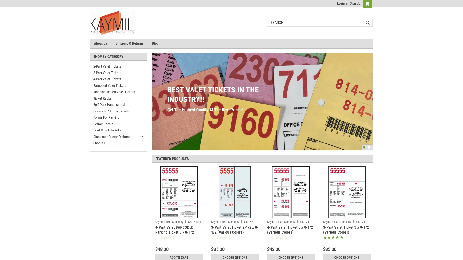
Caymil also sells ticket racks for valet stands, so tickets and storage come from one source.
Our perspective
Most layout problems we see described in this industry come down to one thing: the artwork was designed to be admired, not read. A ticket lives in a pocket, a windshield or a wet hand. It needs a strong number, dark ink and a clean scan zone.
Since 1937 we have specialized in parking and valet tickets, and our view is simple. Contrast is a production decision as much as a design one. The ink, the stock, the carbonless copies and the barcode all have to work together, which is why we offer sequential numbering, barcoding, logos, custom colors and multi-part formats in one place.
Brand identity belongs on the ticket, in the header, the logo and the stock color. Operations belong in black ink, large and plain. When the two are separated this way, a ticket looks like your hotel or garage and still moves a line quickly.
Richard
FAQ
What is the best color combination for a parking ticket?
Black ink on white or off-white matte stock is the most reliable pairing for both readers and scanners. Light tints are fine for color coding, provided the black text still stands out clearly. Avoid pairings that rely on hue difference alone.
Can I put my logo or brand colors next to a barcode?
Keep both away from the bars. Barcodes need clear space on each side and a plain light background, and a colored element that looks dark to the eye may reflect red scanner light and read as blank. Place brand colors in the header or a side band instead.
What type size should a valet ticket use?
Accessibility guidance favors 14 to 18 pt where space allows, but a small claim check cannot hold that everywhere. Make the ticket number and time the largest, use a clean sans-serif face, and keep terms as short lines at the biggest size that fits.
Do ADA contrast rules apply to parking tickets?
The ADA standards on non-glare finish and light-on-dark or dark-on-light contrast are written for covered signs, not claim checks. They still give a sound design benchmark. For legal requirements on ticket content, confirm the rules in your state or city with your attorney.
Do WCAG contrast ratios apply to printed tickets?
WCAG ratios such as 4.5:1 for smaller text apply to electronic documents and images. They are helpful when you review a digital proof, but the printed result on the actual stock is what counts, so always test a physical sample.
Sources
- Designing With Visual Contrast, Institute for Reading Technology
- Chapter 7: Communication Elements and Features, U.S. Access Board
- EBU Clear Print Guidelines
- Testing Color Contrast in Non-Web Documents and Images, Section508.gov
- 20 NYCRR 538.3, Issuance of tickets, Cornell Legal Information Institute
- Valet Ticket Template: Required Fields and Disclaimers
- GS1 2D Barcode Colour and Quality Guide
- Barcoded parking tickets: faster lines, fewer disputes
- How to Make Your Brand Colors Accessible Without Ruining Your Identity